Stop Treating Your Dashboard Like a Spreadsheet (My Philosophy on Metrics)
_1784817635108.png) Bill Brown
Bill BrownA real business dashboard answers one question within five seconds — are we winning or losing right now? Psychologist George Miller's foundational 1956 research on working memory established that human attention holds roughly 7 items (±2) simultaneously; exceeding that ceiling degrades comprehension and decision speed. The best operational dashboards in home service show one metric per team — large, with a target and a color signal — and nothing else.
Business analytics dashboards have gone off the rails.
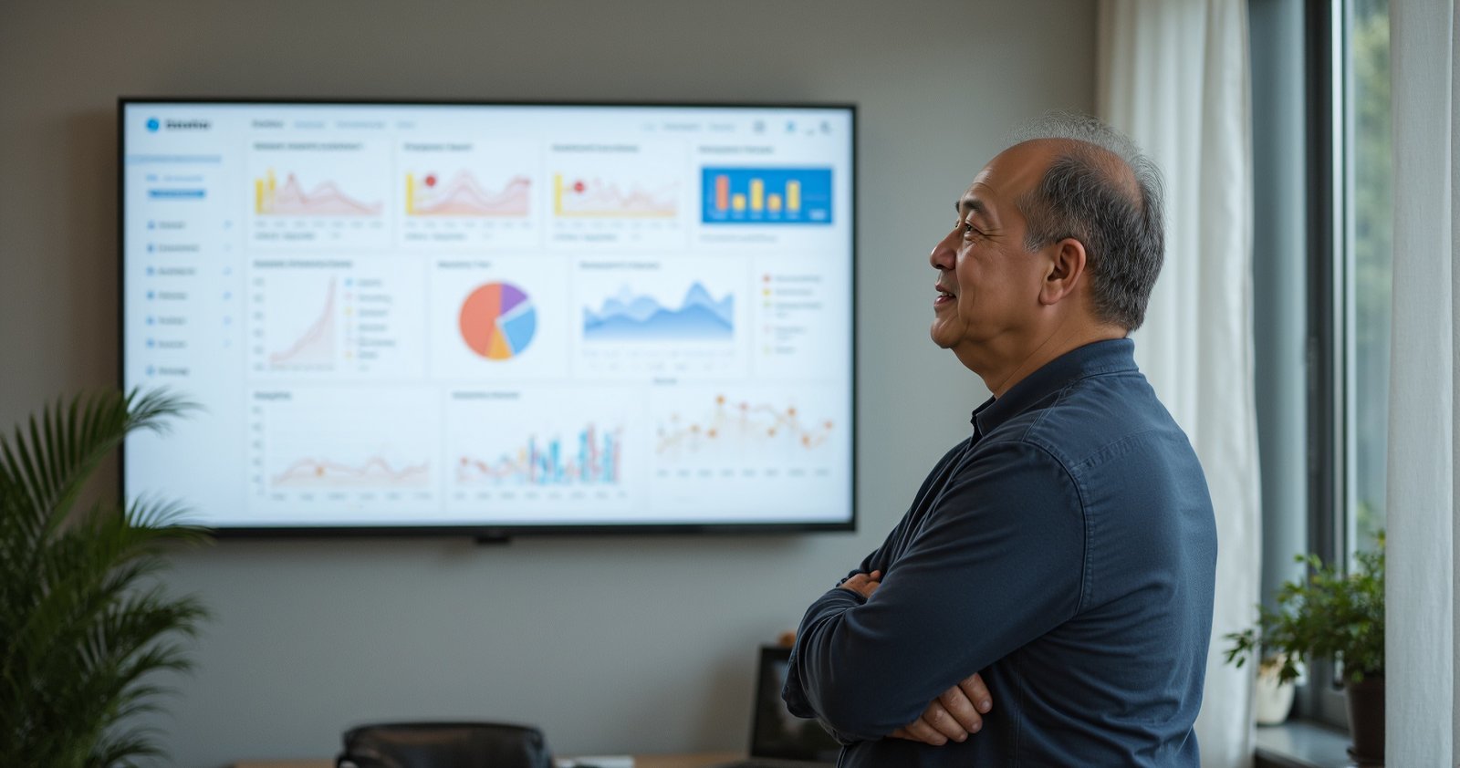
Over the last few years, they have started to look like 24-hour news channels. You know what I mean—tickers rolling across the bottom, pop-ups on the side, and noise everywhere. They are crammed with so much data that you have to stand there and study them to understand what is going on.
If you have to study it, it's not a dashboard. It's a report.
I've built countless dashboards over the years, and I've developed a specific philosophy on how they should work in a trade business. It comes down to the difference between a spreadsheet and the dashboard in your truck.
The "Car Dashboard" Philosophy
Your truck's dashboard has a lot of information wired into it, but it only shows you what matters right now.
- The speedometer is large because you need to glance at it constantly.
- The gas gauge is simple: E to F.
- The "Check Engine" light only comes on when you have a problem.
It doesn't give you a spreadsheet analysis of your fuel injection ratios. It just tells you if you have enough gas to get where you're going.
A Tableau survey of business analytics users found that 74% report feeling overwhelmed when a dashboard displays more than 8–10 metrics simultaneously, and 43% say they stop consulting dashboards that require more than 10 seconds to interpret. More data on screen does not produce better decisions. It produces dashboard avoidance.
Business dashboards need to be the same. They should be quick indicators of something very specific. They shouldn't try to shove the entire organization's data onto one screen.
When I put a dashboard up on a TV in a call center, I know it's a winner if every employee knows exactly how to read it within 5 seconds, without me explaining it.
Why I Scrapped the DIY Class (And Built an App)
I recently planned to launch a class on ServiceTitanHacks showing you how to build a custom "3-Day Call Board."
But as I was building it, I realized I was violating my own rule. The DIY version was becoming "noisy." It required too much setup, too many broken formulas, and too much maintenance.
So, I pivoted. I built a standalone software app—The Titan Call Board—that strips away the noise and focuses strictly on the "Gas Gauge" of your business: Capacity.
The pattern I ran into is well-documented. Harvard Business Review's research on organizational complexity found that the average time employees spend navigating complex internal tools — fighting broken formulas, resolving data conflicts, maintaining configurations — consumes 40% of their productive working hours. A DIY dashboard built on spreadsheet exports and manual ServiceTitan data pulls is exactly that kind of complexity: functional enough to start, fragile enough to quietly consume your team's attention every single week.
The Digital Whiteboard Concept
The Titan Call Board is designed to be the simplest tool in your stack. It functions like a beautiful digital whiteboard, but with data synced directly from ServiceTitan.
Here is how it works, and more importantly, why it works that way:
1. The "Red to Green" Dial
We look at the next three business days. Each day has a simple dial indicator. It calculates a simple fraction: (Current Jobs / Jobs Needed).
- Current Jobs: This pulls automatically from ServiceTitan. You can filter by Business Unit or Job Type.
- Jobs Needed: This is set manually by you.
2. The "Hack": You Don't Need Perfect Data
This is the part ServiceTitan users will appreciate. Usually, to get a good capacity report, you need to have ServiceTitan's "Adjustable Capacity Planning" set up perfectly, and your technician schedules need to be immaculate.
This dashboard bypasses that.
You don't need perfect schedules. You just need to know, "I need 10 installs on Tuesday, and I currently have 6." The dashboard flashes red. The team knows the goal. Action is taken.
3. Why It Isn't Fully Automated (The Human Element)
I made a conscious decision not to use AI or algorithms to set the daily targets.
If a dashboard is 100% automatic, it runs in the background and people stop looking at it. It becomes wallpaper.
By making the "Jobs Needed" target manual, it forces the Call Center Manager or Owner to take ownership. You look at the weather (which is built into the dashboard), you look at the team availability, and you set the target.
- You set the goal.
- ServiceTitan provides the actuals.
- The team chases the green light.
Simplicity Wins
The goal of a dashboard isn't to allow you to drill down into ten layers of data on a giant screen. The goal is to tell you if you are winning or losing, right now, at a glance.
The evidence supports simplicity. Nielsen Norman Group's research on cognitive load and interface design consistently shows that reducing the number of choices and data points displayed improves decision speed and increases the likelihood of action. In a call center context, a single metric on a large screen drives faster, more confident booking decisions than a panel showing twelve competing indicators.
If you are tired of "News Ticker" dashboards and want a clean, actionable view of your 3-day capacity, check out the new tool I just launched.
Ready to See Your Capacity at a Glance?
The Titan Call Board gives you a simple, beautiful view of your next 3 days—synced directly with ServiceTitan. No spreadsheets. No noise. Just clarity.
Get the Titan Call BoardCommon Questions
What's the difference between a dashboard and a report in ServiceTitan?
A report requires you to sit down and study it to extract meaning. A dashboard tells you immediately — within 5 seconds — whether you are winning or losing on a specific metric right now. If you have to dig into a dashboard to understand what it's saying, it's actually a report. A real dashboard is as simple as the gas gauge in your truck: it tells you if you have enough to get where you're going.
How should I design a dashboard for my home service call center?
Start by deciding the one metric that matters most for that team right now — usually capacity fill rate or bookings against target. Build a single large visual around that metric. Everything else is noise. The test: any employee should be able to read the dashboard and know whether the team is winning within 5 seconds, without an explanation from a manager.
Why shouldn't my business dashboard try to show everything at once?
Because the more you show, the less people look. A dashboard crammed with 20 metrics becomes wallpaper — people stop reading it entirely. Each additional metric dilutes attention from the one thing that actually drives behavior. Pick the metric you want the team to move, make it impossible to miss, and remove everything else.
Should I set manual or automatic targets in my ServiceTitan scheduling dashboard?
Manual targets outperform automatic ones for team engagement. When a manager sets today's jobs-needed number based on weather, staffing, and judgment, they take ownership of the goal — and so does the team. Fully automated dashboards run in the background and people stop looking at them. The human element in setting the target is what makes the metric feel real and worth chasing.
How do I display my ServiceTitan capacity on a TV screen for my team?
Tools like Titan Call Board pull data directly from the ServiceTitan API and display a simple 3-day capacity view on any screen via a secure link or QR code. The team sees the same number in real time — no one has to ask dispatch how the day looks, and managers don't need to be in the room for the information to be actionable.
Can I build my own ServiceTitan capacity dashboard without a third-party tool?
Yes, but the DIY version almost always gets too complicated. Building a custom dashboard requires working around ServiceTitan's reporting structure, maintaining formula dependencies, and keeping it clean enough that the team actually reads it. Most DIY dashboards become noisy and stop being used within weeks. A tool built specifically for the ServiceTitan API is usually simpler and more reliable than anything built in spreadsheets.